Who doesn’t like crafted objects? Especially in Berlin, the city is supposed to be a creative hub and full of people with artistic side hustle (including me).
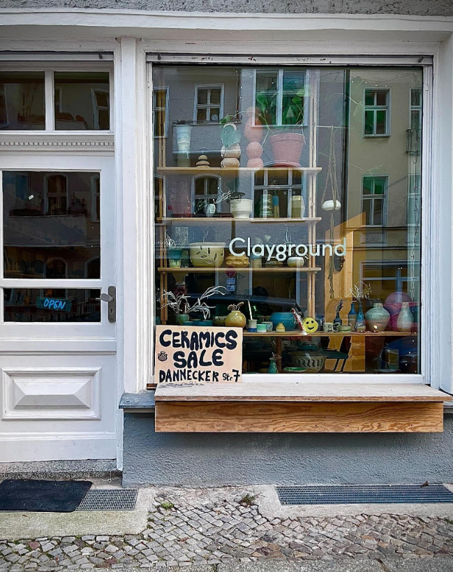
For our project, we worked with Tiziana, the owner of Clayground. The shop, specialized in ceramics, is in Friedrichshain, a neighborhood quite famous for an alternative creative scene and bars. The owner offers workshops about ceramics and sells her work as well as the objects of other artists. We got in touch with her via Claudia, who she knew from taking a class with the owner.
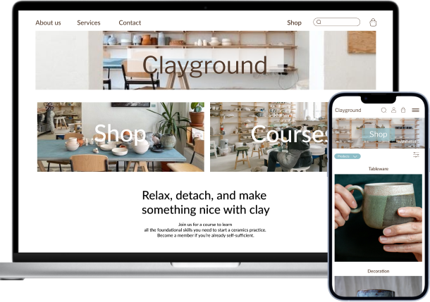
The goal of our project is to create an e-commerce site where she could showcast her work and sell it there.
What is ceramic about and what people think of it?
After some research about pottery, we can see that people are more and more interested in this topic, to do by themselves or to own some. The problem, that often customers meet, is to not be able to buy from an actual e-commerce store and mostly to not get the feel of it: the photos are flat and don’t give much indication about the size and weight, or simply the texture.
From our research, we discovered that there were around 30 small ceramic shops that would be direct competitors to Clayground. The indirect ones would be bigger corporations, such as Ikea, Galeria Kaufhof, Woolworth etc. We also found out that around 67% don’t have e-commerce, and some use other platforms such as Etsy or Instagram.
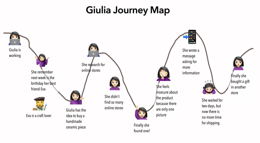
Giulia, our persona
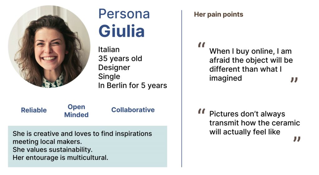
From the interviews and researches, we came up with our Persona: Giulia. She is a 35 years old Italian designer living in Berlin and she would like to buy a gift for the birthday of a friend (we discover from our interviews that often people buy ceramic to offer as a present). She finds a store, but can’t find information regarding the size or a proper description of the object (maybe the color isn’t accurate either?). She then contacts the shop but doesn’t get an answer in a timely manner. Therefore she had to buy from another store at the last minute.
Finding solutions to our problem
To solve this issue, we asked ourselves: how might we provide a way so the customers have more awareness about the product before they buy it?
We then used our creativity to come up with ideas that could solve the problem. We thought about augmented reality, videos that would show the pieces in 3D and more. It would be hard to implement for the store we thought, so we came with other suggestions such as: giving the details about the object (size, weight), making photos of the ceramic being held by a person or putting the object in their everyday life context (a bowl with cereals for example).
Let’s organize our website
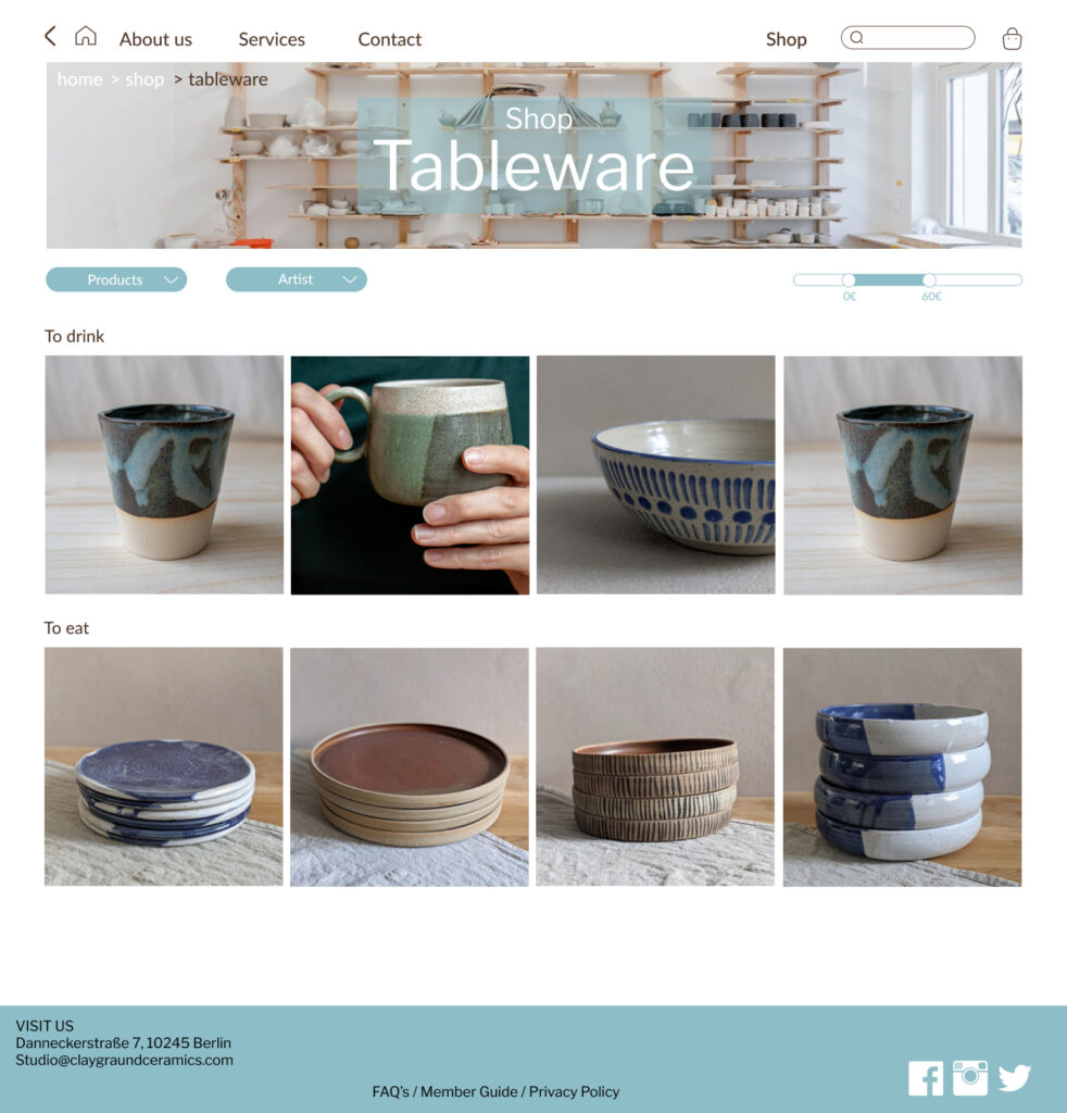
After establishing a sitemap, we also had to come up with a categorisation of the objects. What ceramic is used the most for, as we also found out in our interviews, is often as tableware or decoration. This helped us to come up with our two main categories for the website.
I am in the mood for…
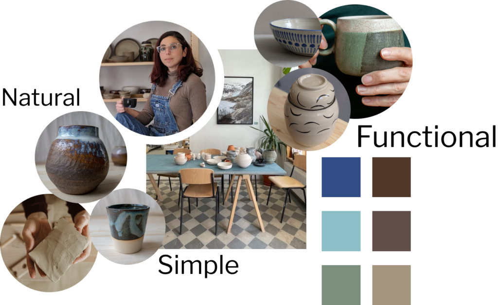
After this, we made a moodboard, inspired from Tiziana’s work, as well as the artists she works with. The colors are earthy, natural, inspired from clay. The turquoise color is taken from the table that is in the middle of the store and is quite characteristic of the place.
Time to build some websites!
We came up with a Lo-Fi prototype that we then used as a base for the Hi-Fi. It would have been better to do the Mid-Fi and test it, it would have saved some time and make us test the product faster without having much trouble modifying it.
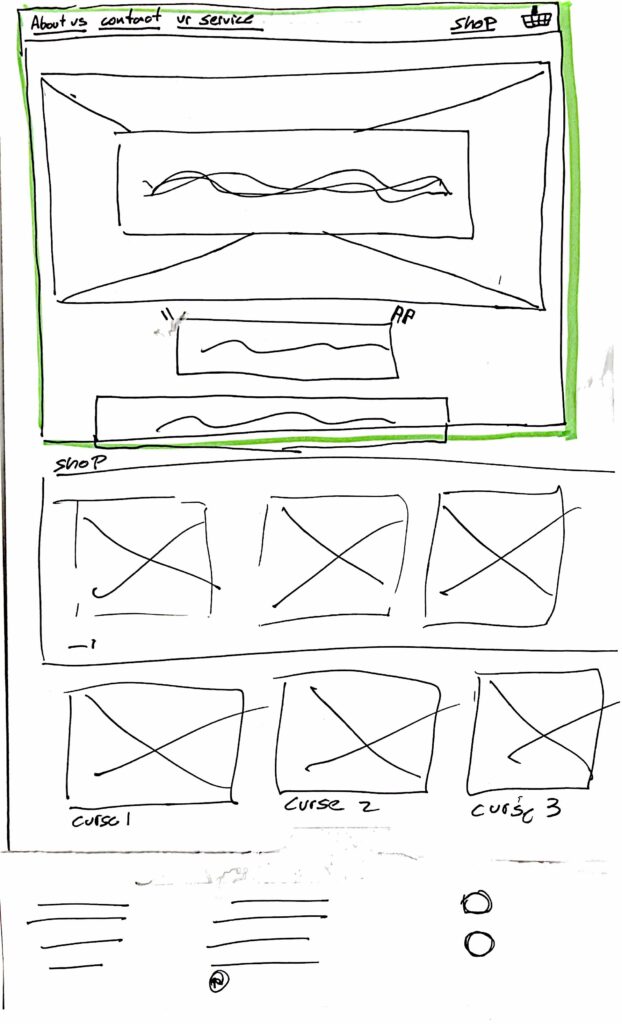
Creating the Hi-Fi was a challenge for us, as we were working together on the same Figma file and not everyone had the same level of knowledge with this app. In the end, the more beginner one took some time but then learned a lot as well.
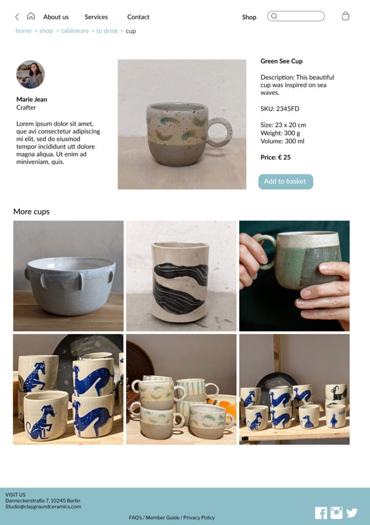
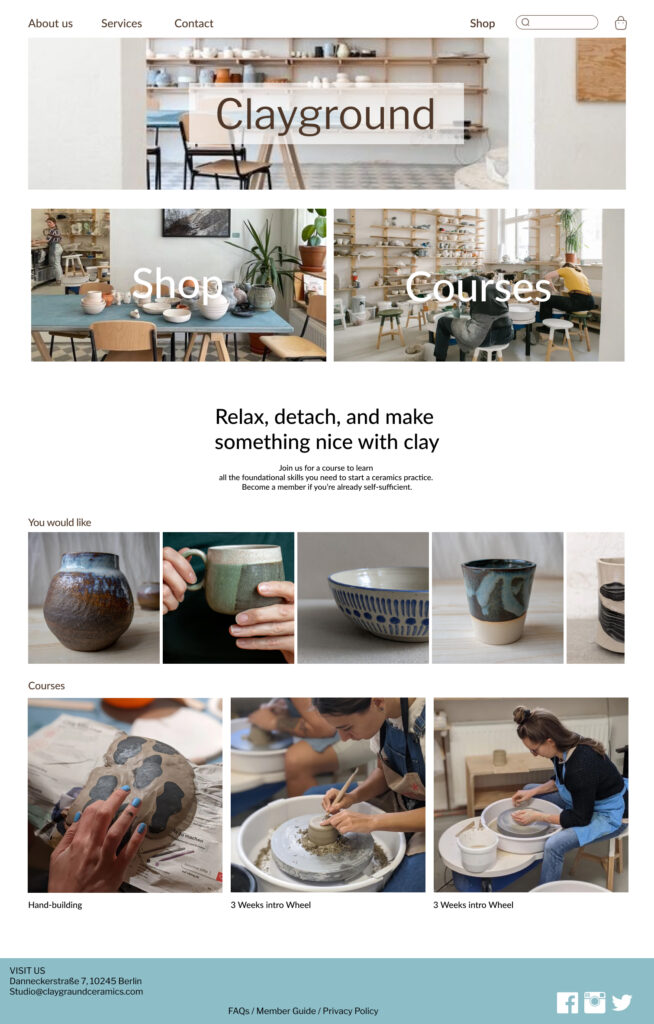
For the user flow (as it can be seen here), we chose the path that Giulia, the persona, could use. You find an object according to the use you want it to have, see a selection and click on it to have information about the artist and the object. If you add to your cart, you can add a gift personalisation.
The ceramics are used in their context or held by someone. We also show pictures of the object at different angles to “visualize” it more precisely.
What users said
The usability testing taught us to not go straight to the point: in the beginning, the user could go directly to one object without seeing other possibilities. We changed this so that the user could have more suggestions too.
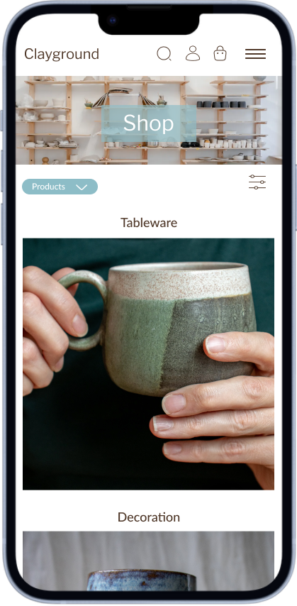
The mobile version
For the mobile version, we decided to change the menu in the top bar into icons. This helps us to save some space.
Covid in 2023…
During this project, part of us got sick, including me. I worked by distance and the project suffered from lack of diversity of opinion. I had trouble getting in touch with my colleagues and couldn’t fully experience this project. The amount of work was quite important for just a few people. The team work was also interesting as the group dynamic was different from the previous one I was in and the people had to do more concessions.
Our learnings from this project:
- The key is to understand the problem we need to solve (problem statement).
- Tests can change everything: that’s why they are so important.
- Different points of view are a precious resource and we need them to do a good job.
- Never forget that we are here to learn.
- Everyone can work together if there is mutual respect and commitment.
What comes next?
- Show the result to the store manager and receive feedback.
- Build more flows and test them.
- Provide information to implementation.