As the Millennial that I am, I had to look for jobs, several times. It can be hard, demotivating, stressful and oups, I mispelled the name of the recruiter in the cover letter…
Hopefully nowadays, job search is easier on many levels: many platforms, you don’t need to read the whole job offer to find informations about the salary (for transparency, the EU asked recently for companies to show the salary proposed for a posted position, but it isn’t the case everywhere…), if full time or part time and so on. Not to forget the fact that we can also now have reviews about companies, but I digress.
My experience…
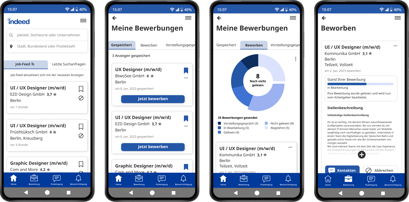
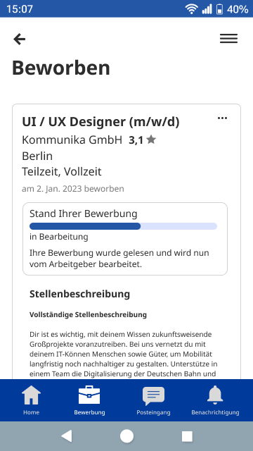
So for my redesign, I decided to work on Indeed. I used it for a few months before the actual bootcamp I am taking part in, and was using the “fast application” option quite often. I always felt a bit lost with this option: it is useful, you don’t always need to enter all your information, you can pick one résumé over the other, and even skip that letter (they admit they don’t read it since they don’t ask for it). Hoplà, send. I then get a confirmation email. After a few days. I might receive an email saying the recruiter read my application, sometimes they refuse or never read it. But, the process isn’t clear.
… and the users’
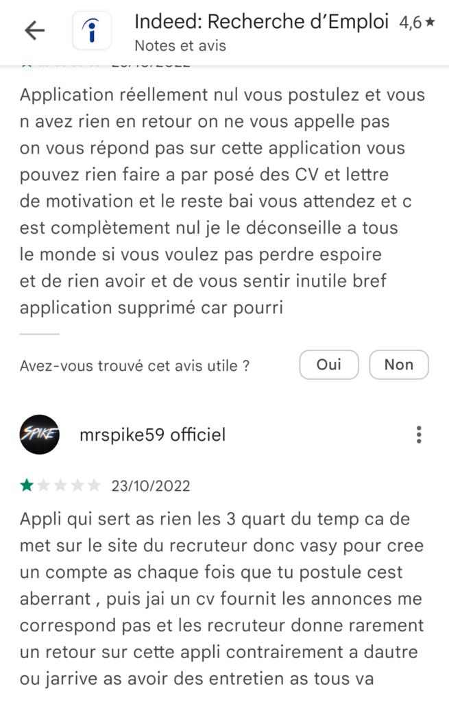
I went on the Google AppStore and read the comments of users for my research and see if other people would feel the same: and yes, they also get confused about the application process and lack answers from the employers.
There we have it, that’s the point I want to focus on: how to better understand the post-application process and how to follow its progression.
Values and branding of Indeed
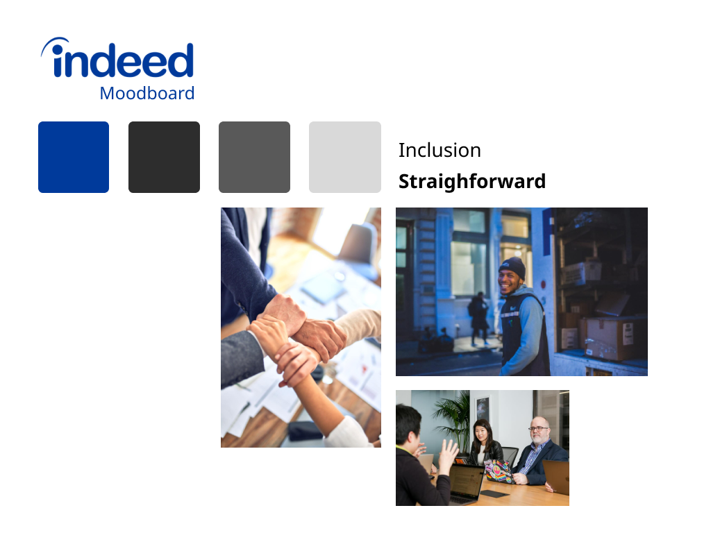
I read about the Indeed branding on their website: I like their focus on diversity, being straightforward and making a platform that everyone can use. I also like the tone they want to use: encourage, formal, casual, reassure.
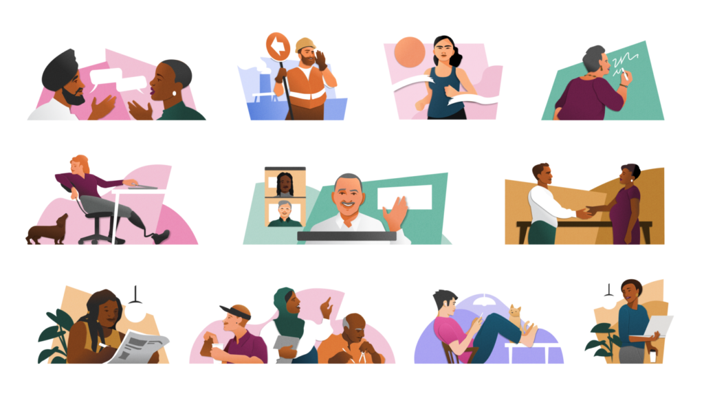
Even though their illustrations are colorful and represent the diversity of the workers, the app and website lack a bit of personality. Its background is white, and any element is either gray or dark blue.
I knew I wasn’t going to do a rebranding, it would take more time than I add for this task and since the users are really diverse (therefore, it is harder to take one design style, since it might not fit the majority of the users), I thought focusing on the features would be more interesting.
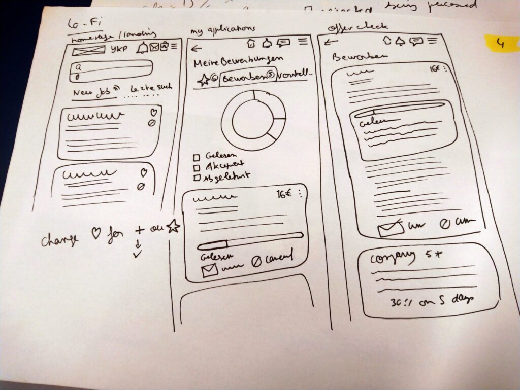
User flow through the app
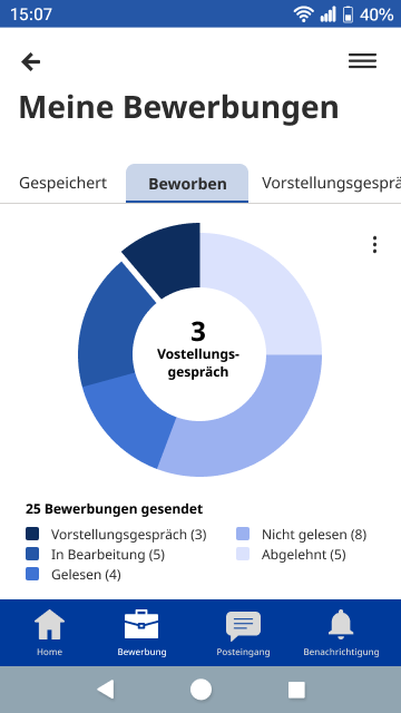
For this project, the goal was to make the elements on our own (except for the icons), add animations and micro interactions while following the user flow: my user would go to check the applications he sent and see where they are in the process. He could see the data (Indeed says on their website, that one of their values is to be “data-driven”, and from what I see, it is more for the recruiters’ sides) of his job seeking process. She or he could have an overview of his applications, see which one went to a next level or how many applications they sent for example. The goal would be to bring clarity to the user as well as encouragement (even if job searching still is kind of soul crushing, let’s be honest).
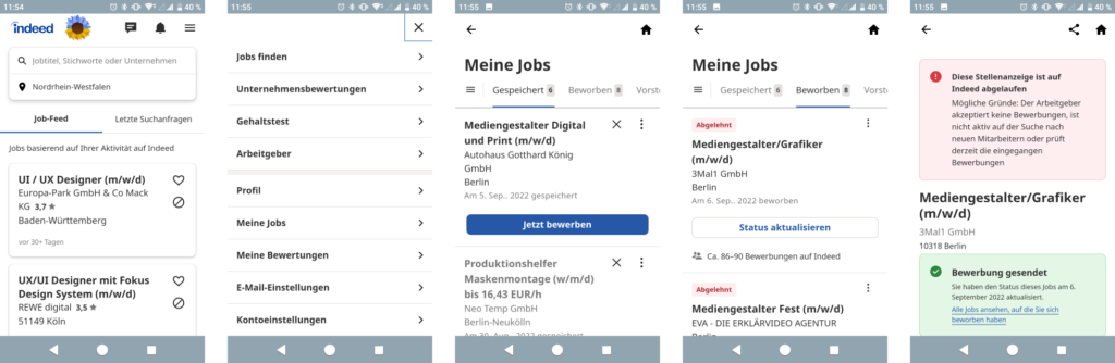
First tests on the original app
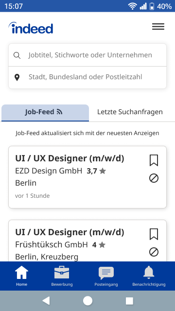
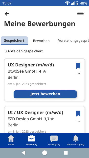
To start my ideation, I did the same user flow as my user. I open the app and look for the application I sent. I struggle a bit, my app is in German (if you want it in English, it then propose you offers from the UK and in £) and they call this part “Meine Jobs”, which wasn’t clear for me and I actually spend quite some time figuring out that it wasn’t in “Meine Bewertungen”, my evaluations).
How to improve the user experience
To reach the category I wanted, I had to do 3 steps (Menu – Mein Jobs – Beworben) and see 4 to 5 screens. For my first idea, I thought about adding one icon for the “Meine Jobs” page. It was then only 3 screens and 2 steps.
After looking at another app, the DHL one, I thought that having a navigation bar for the app with the main categories would be useful. And I decided to make it blue, which gives a bit more “colors” to the app: on my Android phone, the gray is dominant).
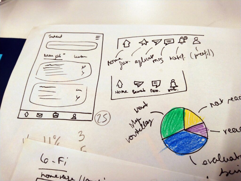
For this navigation bar, I wasn’t sure which color to use for it so the user could see in which category they would be. I stayed on the color palette of Indeed, which wasn’t so good as it lacks contrast. It is one thing I would need to improve later on. I wanted to use text under each icon so the user would still understand what the picture is for, including more users.

I changed the heart for the “saved offers” for a bookmark. That might be personal, but I don’t know if putting a heart icon to save a job offer is really fitting?
I kept the order of the categories (saved offers, applied, interviews) as in the app, I would have put the “applied” first, but I think you would check more the one you saved as you might have now time to apply, and would therefore less into checking where you already applied.
Some challenges for me: I wanted the user to be able to visualize all the data related to his job application. I thought about a pie chart, where you could click on each category and see the number or pourcentage.
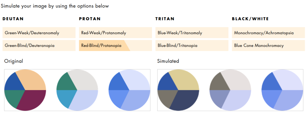
For this, I took quite some time figuring out the colors to use (Indeed has other colors then blue, but I didn’t like how they combined together. Also I checked the color version of the pie and the blue “gradient” and it seems to be easier to read for people who would have color vision deficiency).
Afterwards, I looked online to see in which orientation I wanted to put the information on the pie, as I also thought about having an animation when the user opens the page. I thought clockwise would be the best: they see the most negative information first (recruiter rejected the application) to the best, the job interview. Reading from left to right, this information would be the most visible one on the pie. With this idea, I thought this would encourage the user to be confident about her or his profil. I also wanted to add an option to hide the rejected applications too, so it doesn’t hurt too much ^^.
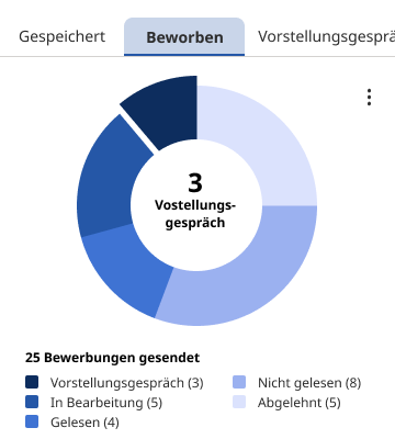
One thing that confused me also with the categories, is that they say “Meine Jobs” and “Meine Bewertungen” and it wasn’t so clear to me. So I decided to change “Meine Jobs” for “Meine Bewerbungen” (my applications)
For the “basic” interaction animation, I was able to find my way on Figma. But for the pie chart…. It took me a lot of time to animate it and integrate it on the prototype. I used Smart Animate and to be able to put the element on the prototype, I transformed it so each animation was an element. I am not sure this is the best way, but it kind of worked.
In the end, I was happy with the result of my redesign: it didn’t look like much changes but enough to make it easier to navigate through categories.
To try the prototype, click here.
I would still need to improve the navigation bar, so there is more contrast between selected elements. For the pie chart, I had the feedback that it could appear on another page or maybe could be hidden eventually. And I should offer the possibilities to add a filter for the job offer the user applied for, which I didn’t think about while designing this UI in 4 days.