Wayfinding solution for Jungfernstieg: project in collaboration with Deutsche Bahn, HVV and Hochbahn.
Have you ever found yourself in a place where you had no idea where you were or where to go? That can be really stressful. Usually you would find your way with the elements surrounding you, landmarks like churches, buildings, sculptures or sounds, smells… You wouldn’t wait long before opening your favorite navigation map. And most of the time it will guide you to your destination.
But what if you are in a building and the app doesn’t have the plan of it? Like a store or a train station? You would follow the signs, maybe the flow of people, the stores, the touch screens to look at your position in the shopping mall. You can of course ask someone, except that they might be lost too.
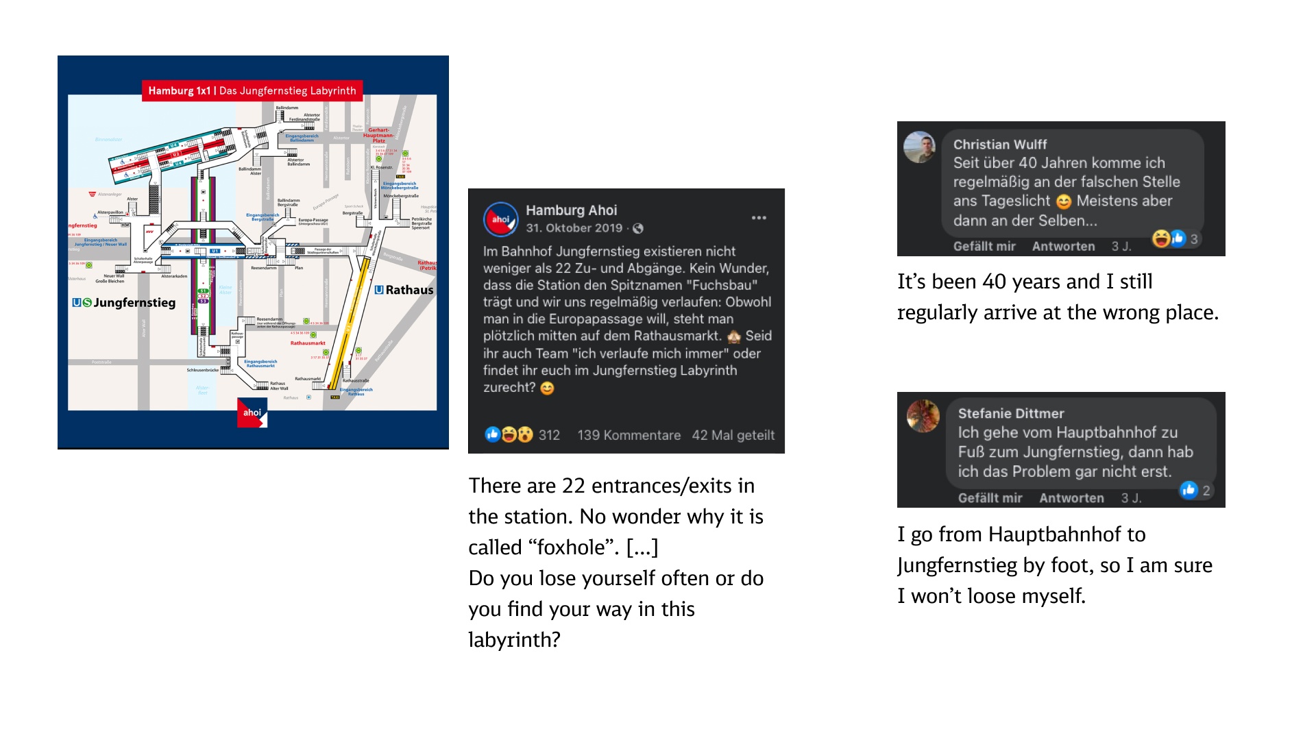
This is the story of the Jungfernstieg station in Hamburg. It receives around 180 000 users daily: there are S-Bahn crossing it, 3 U-Bahns and you use it as a passage underground to reach multiple streets in the city, or to go the Europa Passage, a shopping mall that attracts quite some of Hamburg’s habitants. It has 4 floors, all underground. And the users get lost, often, even the ones using it daily. They call it the “foxhole” and it became a running joke in the city.
Deutsche Bahn asked me and my project partner to come up with a “digital companion” to help with this situation.They proposed 3 challenges, all related to way finding which was a new topic for me and I learned quite some things about it and I really like this topic and hope to work more on it in the future.
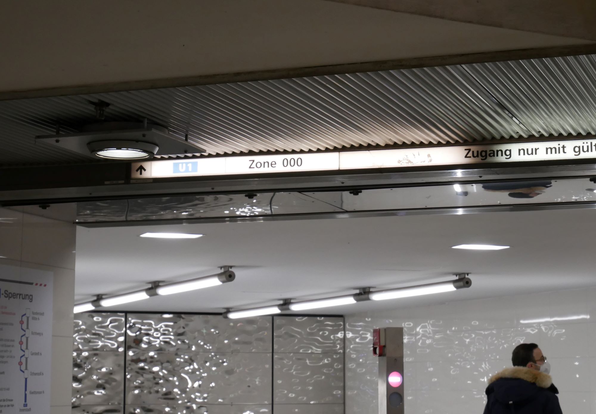
For the “challenge”, we got invited to go directly visit the station in Hamburg and do qualitative research with the users. As we’ve never been here before, we came there with new eyes and saw the things that were not working well: the arrows on the signs can show a confusing direction (go “up right” when actually the sign right after tell you to go downstairs to reach the U-Bahn), the structure interfering with the signage (if you are really tall, this can be annoying), the design is not fully standardized (from different years or between the U and S-Bahn which belongs to 2 different companies, HVV, Hamburger Verkehrsverbund and DB, Deutsche Bahn). Overall, we could say that this station isn’t really “user friendly”. Before visiting the station, I spent some time learning about wayfinding and it was even more apparent to me that it was confusing for users.
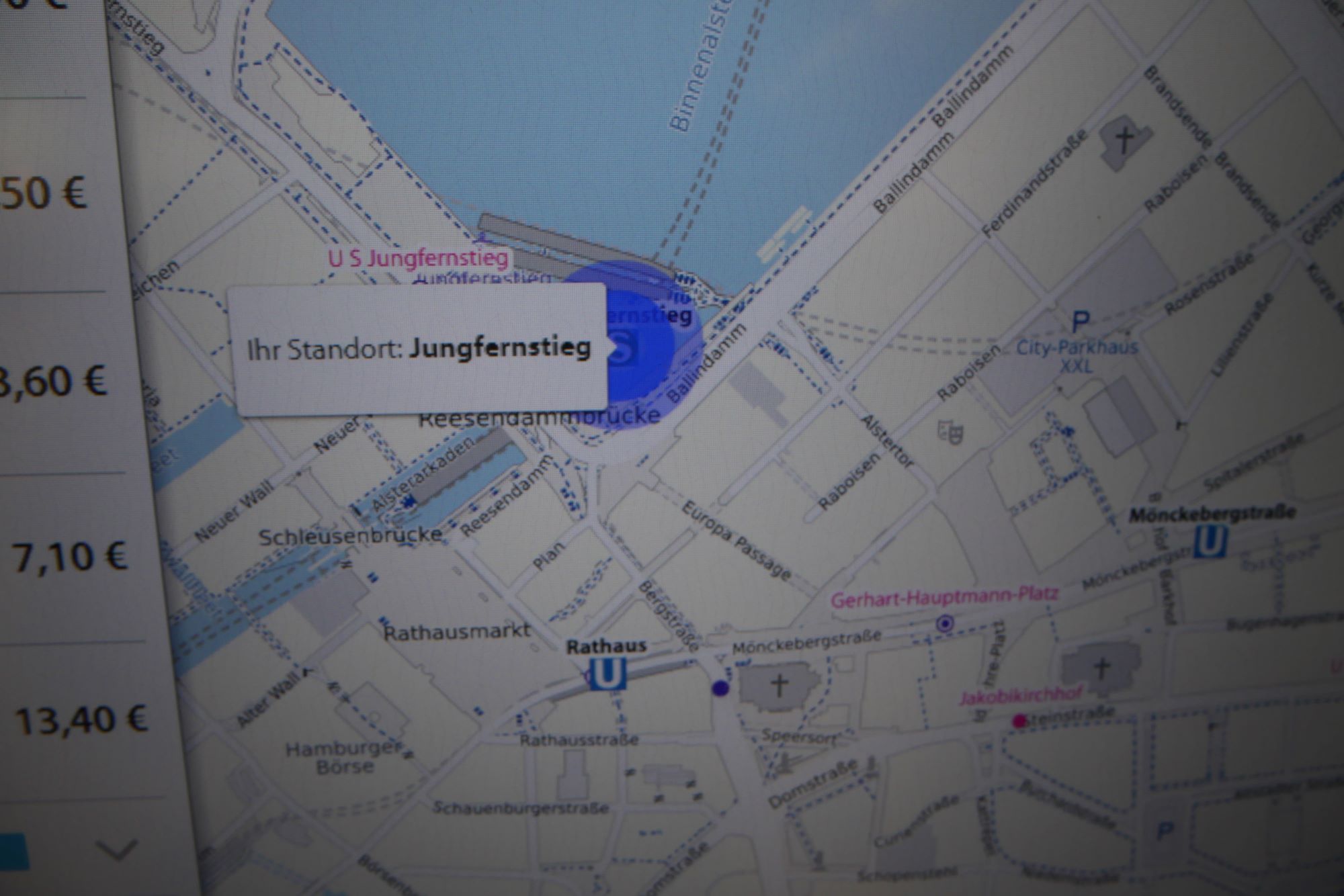

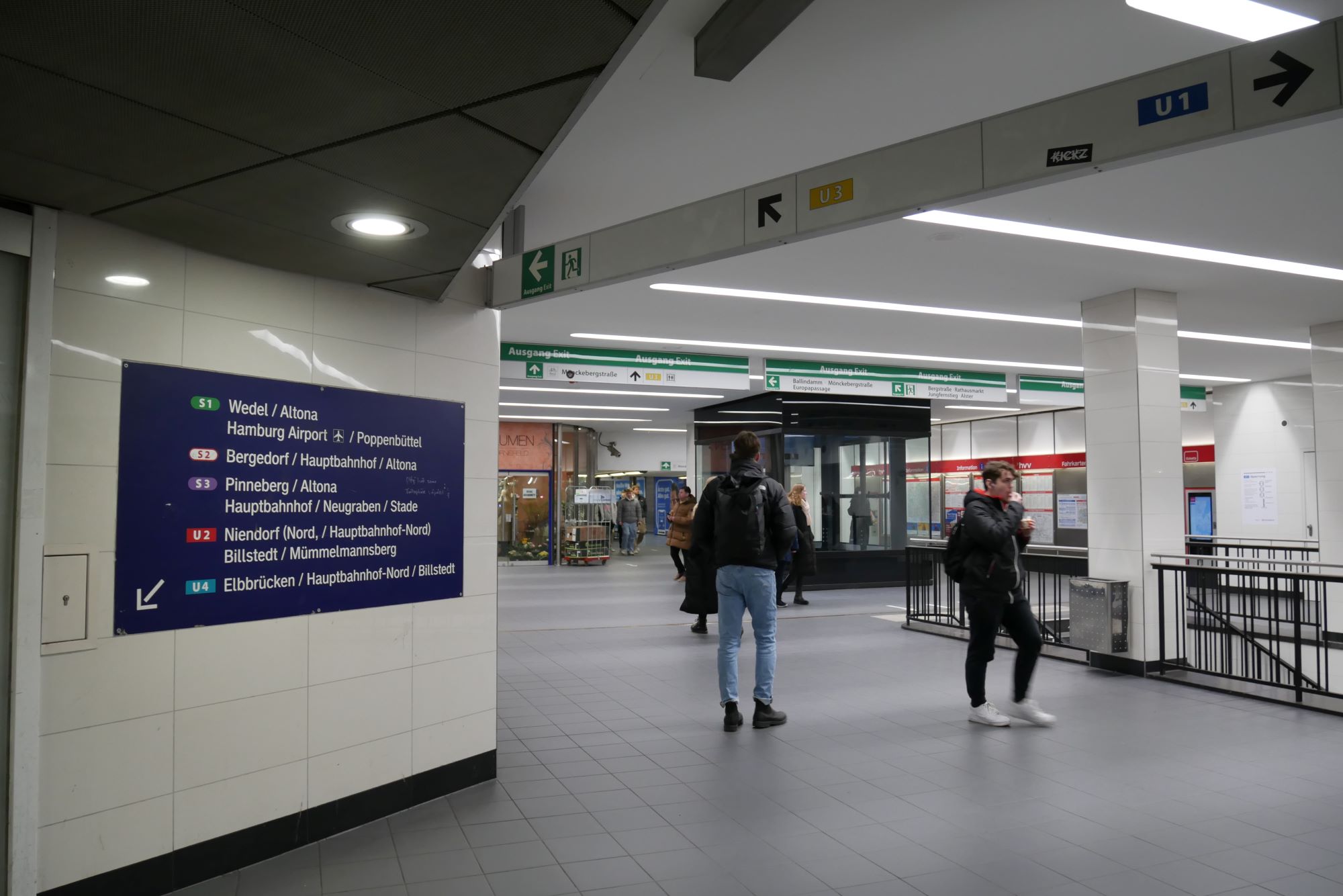
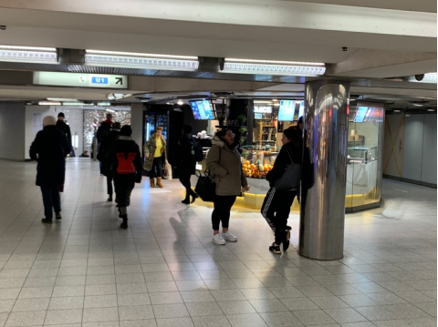
In Jungfernstieg,what is adding to the confusion,, is the fact that there is not much information inside the station either: there are the selling machines for tickets, you have a map on the screen but it shows only Hamburg’s network. For the station itself, you don’t get a a clear view of the station. And because you are in a closeted space, you can’t use landmarks to orient yourself (apart from the little shops inside the station). We met different users, they were between 40-50 on average, as well as some people in their early twenties and one woman in her late seventies. They would all use the station regularly (2 times a week or everyday) and would also struggle using it.
We met a woman who told us that she uses the same U-Bahn everytime and then go to her exit. One day though, she was with her mother and she wanted to go to Europa Passage (told you, this is a famous place) and they got lost: the signs barely mention this shopping mall inside the station and also, the streets aren’t indicated on the exit signs (see photos above).
One user, a mid-age man, told us that he finds his way inside but, even though he had a brand new flipping smartphone, he is not fond of the people having their nose on their phone non-stop (one customer less for our app, I guess?).
A mid-age woman was having difficulties finding her way and asked a worker from the bakery. We decided to ask her what she thought of the station. She proceeded to show us the HVV app with the integrated map and Googlemaps. She would spell the address to the phone, but the phone would misunderstand it and show a wrong street. On both maps, we couldn’t see the plan of the station, and the street connected to the exit would appear but not on the signs in the station. As she told us, she can easily get distracted, too much information or unclear ones (like this diamond shape for the bus). She told us that she would rather have a button to press and talk directly to someone. Interacting verbally seemed important for her.
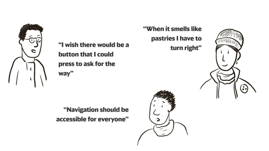
One user, which we both enjoyed talking to, was a visually impaired woman, walking with a white cane toward a U-Bahn. We asked her about her experience: she received a training from HVV to learn the path she would use in the station. She would remember the stairs or escalator, use the neon blue light on the column (something that we found debatable design wise, but is actually useful for other people) and the smell of the bakery. We noticed that there are no tactile displays on the floor, which would help a lot, as the user reconed. It was our favorite meeting of all as she would be part of the users facing the most difficulties in this situation.
One last person we asked was a kebab owner, everyday and several times a day, he gets to guide the users to the right U-Bahn or exit.
After this long morning in the cold station, came time for lunch and a warm place. We went to have a hamburger, that was creative of us, you would admit.
In the afternoon, we tried to ask more users, but to no avail: it was late afternoon, and it seemed like people were more in a rush than earlier. Later we joined our DB clients, Franziska and Chistine. We compared France and Germany, and if you want to be the center of attention with your friends, you would know: in France, you discover on which track your train arrives 15 minutes before its departure. In Germany, they rarely change the track for dedicated trains, so, you can have the problem of having to run to another platform a few minutes before your train arrives. In France, the trains circulate on the left (English’s Highway Act from 1835), except for Alsace-Moselle, because it follows the German way, on the right. And the last thing is that you can’t cross France without having to change your train in Paris. There are 5 stations, you go from one to the other to get your second train. In Germany, you can go everywhere, you might need to change in a station but no need to always stop in Hannover for example.
Alright, let’s go back to our project.
This meeting was interesting, we understood better the goal of this challenge: coming up with an idea that they could use as an inspiration for a bigger project.
Back in Berlin the next day, we decided to start to work on our interview insights. We came up with a solution, which was already in the client brief: creating a digital tool to help the user find their way in the station.
But if I can add something there: I didn’t know the station before going there, but I already thought that one solution might not be an app. If signs are clear, it should be enough for the traveler. Then you add an app to help more people or users with different needs or wants.
After the interview, I thought that an app wouldn’t be the best solution, but since DB also asked two other groups from our class to work on signs,it wasn’t going to be our topic. The goal would anyway be to think about a solution that could be upscaled to all the stations in Germany (there are 5400 of them).
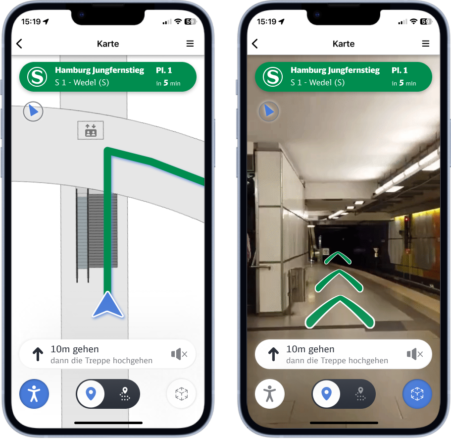
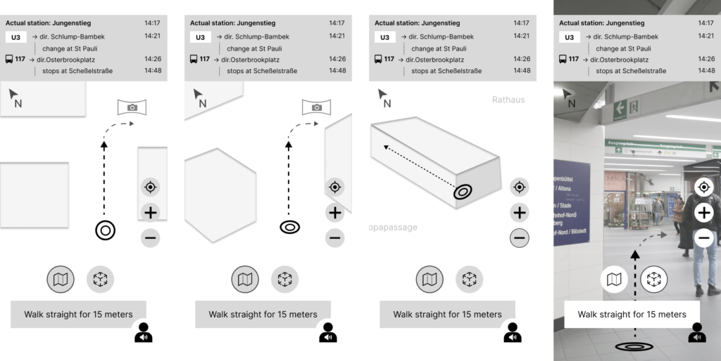
We came up with different solutions, the first one would be a map, in a 2D view from above (standart map vision). The second idea would be an AR (augmented reality) version as we also looked for other technologies for wayfinding.
And the last one, was an audio guide: instead of looking at a map, it would tell you where to go as if someone was telling you the way.
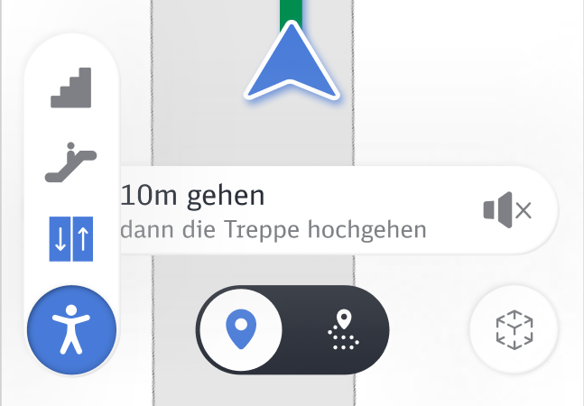
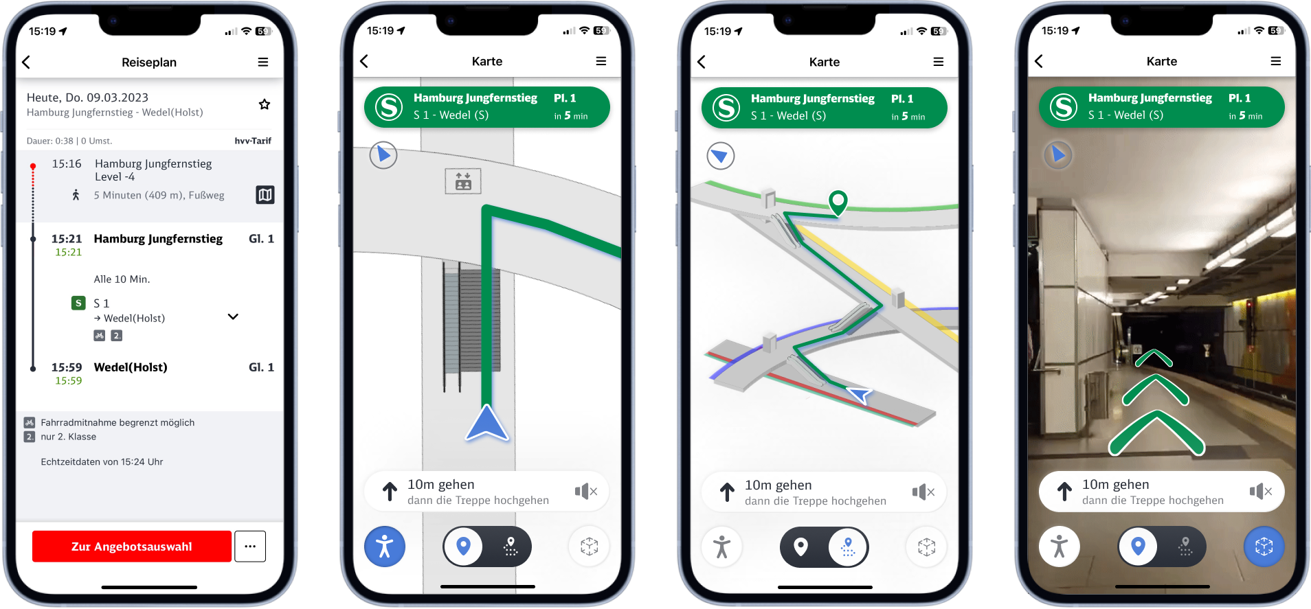
For the map, I wanted to know if people would also use a 3D map, where you would see the different levels and understand how the platforms interact with each other. The maps we found online are flat and aren’t so helpful
To orient myself in everyday life, I tend to have a map in my mind and in 3 dimensions. In the Jungfernstieg station, it is so complicated that I wouldn’t be able to come up with one. I wondered if the users would find their way better if they could visualize the station this way, in 3D. We conducted new interviews to find if people would understand and use these 2 different maps.
We then printed prototypes of the maps and ideas and went to a station in Berlin and asked the users what their opinions were.
For the two different maps, we asked them to go from the U2 (bottom line) to U3 (upper line), first with the 2D/flat map and then with the 3D map. They would find their way fast on the 2D map, but if we showed them the 3D version, they would need more time to see how you can go from one platform to the other, if there are elevators or just stairs, which wasn’t shown on the flat map. For disclaimer, we had also no updated maps for this project and had to also create some content, which couldn’t be fully accurate. In the end, with the 3D maps, the user would actually understand better the station and what is the best way to use (on the U1, in blue, people would see the small path parallel to the station, and would consider using it to avoid the travelers of the U1 on the platform). We proposed the AR version, they seem to be interested, as long as the loading is fast enough and accurate. Someone though said, they wouldn’t like so much to have to hold their phone in front of them the whole way. And lastly, the audio-guide, which was an idea that I liked as this could be a base for people with visual impairment (or people who don’t want to have their smartphones in front of them). This was not a solution users would choose over the map, as it might interrupt the music they listen to for example, but one person said that it would be fine for them, so they would have their hands free.
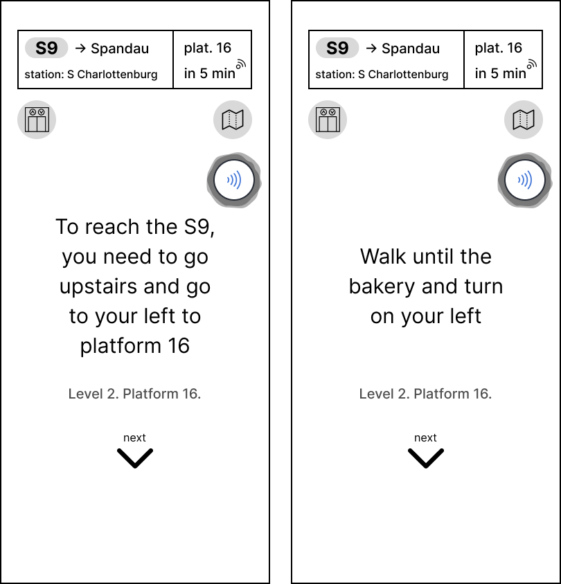
Coming back from these interviews, we used the mid-fi we already did to change it where we could fit these features in the app: 2D and 3D maps, AR, the audio-guide and the possibility to see if there are elevators on the way.
We came up with this mid-fi (which is more like a hi-fi):
We used these mid-fi files and asked to get feedback on the design. We wanted to integrate our map inside the Deutsche Bahn app (which has a lot of hidden features) as we got the user feedback that they wouldn’t download an app just for one map. For the scalability of the project, this would also be easier to implement. This way, it allowed us to follow the DB graphic chart which was useful but at the same time, I think some elements could be proposed in a different color or with more contrast to help better the user (light gray and lighter blue can be hard to differentiate).. From our tests, we got the feedback that some icons or functions would be confusing, and we changed them later in the hi-fi.
Later, we had our 3rd meeting with the DB colleagues, they looked a bit disappointed that the audio project wouldn’t be continued (the visually impaired woman gave us this idea) and that AR wasn’t the main app, but we wanted to follow what users gave us as feedback. I wish I could have done an audio-guide too, but it was hard to go this path as the users were more leaning toward a map solution and our challenge was finding a solution that would fit most of the users.
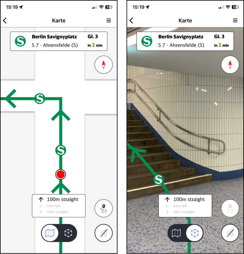
We went to the hi-fi prototype and we got lucky to get a 3D map made by an architect friend. The user flow was one of the female user we had, the one that would lose herself in the station with her mom. The user would be able to choose different ways to navigate: with the two maps, AR, both being compatible with the audio feature, and the possibility to choose if the user needs the elevator or escalator instead of the stairs. This would change the path inside the station to make it more accessible. Instead of having some ideas as a main app we decided that the best solution would be to integrate all of them as features.
As mentioned before, when it comes to design, we took inspiration from the DB and wanted to give it a new design touch inspired from neumorphism. This isn’t always the best solution for visual accessibility on its own so we decided to also make the icons with a lighter gray or better contours. We kept the blue when the button is “pressed” or the option is active. Then, I decided to use blue as the active button instead of just the icons.
For the line that would guide you (green for S-Bahn), we took the idea from our research about wayfindings and how in some stations they paint lines of colors to guide the users to their station. This could be a useful feature in Jungfernstieg and we thought about using it in the app.
On the 5th of April, we had a meeting with the stakeholder from Hochbahn and employees from the DB: we shared our research and discovery as well as the prototype. Another meeting is planned to have a follow up.
In conclusion, I would have liked to go one more time to Jungfernstieg and test with the users directly there: maybe we would have got some insights that would help us come up with a different idea or improve the present one. I wish I could have developed another app project instead of a navigation map app: of all the users we met, and we would have needed more time and more people to make it more interesting for our project, a digital map app would be the best first solution, alongside a more clear signage system inside the station.
Project done with Marcus.